|
|
Post by gr0undzer0 on Apr 13, 2009 9:17:32 GMT -5
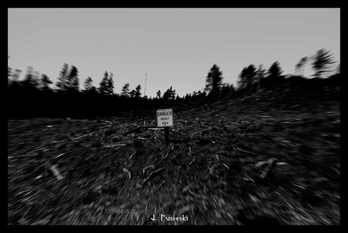
who is this shadowy figure ?
|
|
|
|
Post by maidli2 on Apr 13, 2009 9:19:47 GMT -5
Dont know him, it's an order
|
|
|
|
Post by maidli2 on Apr 15, 2009 2:21:55 GMT -5
well i guess if i want to be paid tomorrow, i'd better finish it today
|
|
|
|
Post by maidli2 on Apr 15, 2009 4:38:27 GMT -5
done
|
|
|
|
Post by gr0undzer0 on Apr 15, 2009 4:56:27 GMT -5
wow that was fast
|
|
|
|
Post by maidli2 on Apr 15, 2009 5:05:02 GMT -5
Not really.
|
|
|
|
Post by maidli2 on Apr 15, 2009 10:18:58 GMT -5
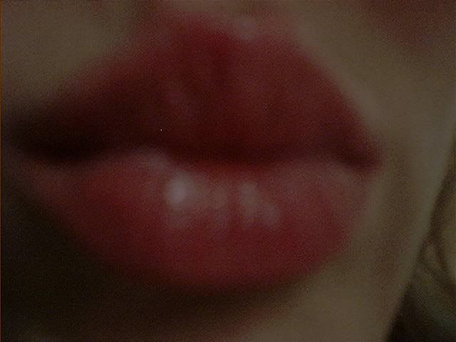
Second step : Shadowing  Third step : STILL Shadowing ;D ;D  Last step : fixing the charcoal and sign   I am terribly bad at photos, sorry for the inconvenience  |
|
|
|
Post by maidli2 on Apr 15, 2009 10:25:24 GMT -5
and a vision of my 7' daughter ; reminds me the Sparks ;D  |
|
|
|
Post by manintheshadows on Apr 15, 2009 11:25:42 GMT -5
They're both ace! And your 7-year old can draw sooo much better than I can  |
|
|
|
Post by maidli2 on Apr 15, 2009 13:34:18 GMT -5
Aaaargh !!! you're OUR OneWhiskey Designer, baby...
|
|
|
|
Post by maidli2 on Apr 15, 2009 13:39:35 GMT -5
Better photo   |
|
|
|
Post by dimples... on Apr 19, 2009 19:13:58 GMT -5
Aaaargh !!! you're OUR OneWhiskey Designer, baby... and rules at it!!! Maidli those are really good...fun to see the progress and with kids projects too...  |
|
|
|
Post by Fields at Midnight on Apr 19, 2009 19:37:58 GMT -5
REALLY good Maidli
|
|
|
|
Post by dimples... on Apr 19, 2009 19:47:42 GMT -5
You seem to even bring an extra bit of kindness to his face... |
|
|
|
Post by maidli2 on Apr 20, 2009 3:11:09 GMT -5
Thank you |
|
|
|
Post by Shoesh on Aug 17, 2009 15:57:01 GMT -5
I finished this a while ago, my Hundertwasser homage. I mixed two paintings of his together and came up with this. The most fun I had was with making paint colours. Posted this somewhere else too, but fuck it! Talked about it here long enough. I should make a better picture of this though :s The top photo shows more detail, while the bottom picture was taken during the day, so it gives you a better sense of the colours I used.  Attachments:
|
|
|
|
Post by maidli2 on Aug 18, 2009 1:32:00 GMT -5
Ooooh shoney that s a pretty homage |
|
|
|
Post by grangerlang on Aug 18, 2009 1:48:10 GMT -5
Hmmm, maybe I should post what I'm working on here. I've got like 3 different versions of a portrait going and can't decide which version to follow through on.
|
|
|
|
Post by maidli2 on Aug 18, 2009 1:52:23 GMT -5
You should , yes
|
|
|
|
Post by maidli2 on Sept 30, 2009 14:27:21 GMT -5
bump
this one is good to me
|
|
|
|
Post by Shoesh on Sept 30, 2009 15:47:06 GMT -5
yeah, grangerlang owes us some pics!
|
|
|
|
Post by grangerlang on Oct 1, 2009 0:26:26 GMT -5
Ha, I totally forgot about this! OKAY, so. Here's a preview snippet of a portrait I'm working on. I only included the face as it's the most 'done' part and the part where I need help. As said above, I've got a few different versions going on and can't really decide which one to follow through on and complete. Any feedback would be GREAT! Unless it's "These are all shit, start over!" I mean, you can SAY that, but you might get a boot in the teeth. They're all basically same, except for what separates the color blocks. #1, just open space, or white (as I will probably do a background of some sort, I could leave it white or make it match the bg)  #2, the 'stained glass' sort of look, with hard color lines  #3, nothing extra separates the color blocks, they are right up against each other  Help me, obi-wans!  |
|
|
|
Post by maidli2 on Oct 1, 2009 2:56:19 GMT -5
The white is good but too much space between blocks according to me. It seems under construction, then... except if it's the effect you look for, of course
The ¤3 , no. It(s the opposite. It tends to nothing expressive, too melt and no contrast as the aim is the "block" effect , i suppose. Too flat, no feeling gets out of it.
I personaly prefer ¤2, stained glass. Because it is the right mix of what i just said above. It's the good effect , it sounds "block" but nor puzzle either melt
Ohhhh, according to me... Cheers
|
|
|
|
Post by Lungsey on Oct 1, 2009 6:49:19 GMT -5
i haven't seen this thread in ages! Shoney i love the acid-atmos in that picture  Not quite sure what you did with it, but it looks like the sort of thing i'd want to stare at whilst being at the dentist. Maidli, you know how much i love your work. Amazing. Your kiddie will take over once you get too old to hold the pencils and stuff! And snotface.... my preference is numero uno! I can't quite explain why, i think the white bits give it more movement for me, which makes it feel more alive than the stained glass effected one. On nr 3 i fully agree with Maidli. Goodluck with it! I look forward to seeing the finished product |
|
|
|
Post by grangerlang on Oct 2, 2009 0:31:45 GMT -5
Thanks guys, that's helpful! #1 is kinda the direction I was leaning, but I couldn't really put my finger on why before you said it |
|


 Not quite sure what you did with it, but it looks like the sort of thing i'd want to stare at whilst being at the dentist.